As a storied franchise in American football, the Las Vegas Raiders have established themselves as a recognizable force. Originally founded in 1960 as an AFL team, the Raiders joined the NFL during the historic AFL-NFL merger in 1970.
With an impressive track record that includes three Super Bowl victories, eight AFC Championships, and multiple division titles, the Raiders are known for their commitment to success on the field. In 2020, the team relocated to Las Vegas and embraced their new identity, playing their home games at the state-of-the-art Allegiant Stadium.
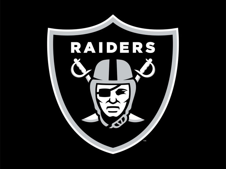
Symbolizing the team’s enduring legacy, the logo of the Oakland Raiders, now the Las Vegas Raiders, stands as one of the most recognizable emblems in the NFL. Featuring a pirate-like figure donning a football helmet, the logo has remained largely unchanged since the team’s formation over six decades ago.
Its timeless design serves as a testament to the Raiders’ rich history and unwavering spirit. As the team continues to make its mark in the NFL, the emblem serves as a visual representation of their relentless pursuit of excellence and their loyal fan base
Why Randolph Scott is on Raiders’ logo?
While the logo has undergone slight modifications throughout its history, one element has consistently remained—the face of American movie star Randolph Scott, whose likeness served as the inspiration for the Raider’s portrait.
The enduring image of the pirate-like figure, inspired by Randolph Scott’s face, continues to symbolize the team’s fierce and relentless spirit.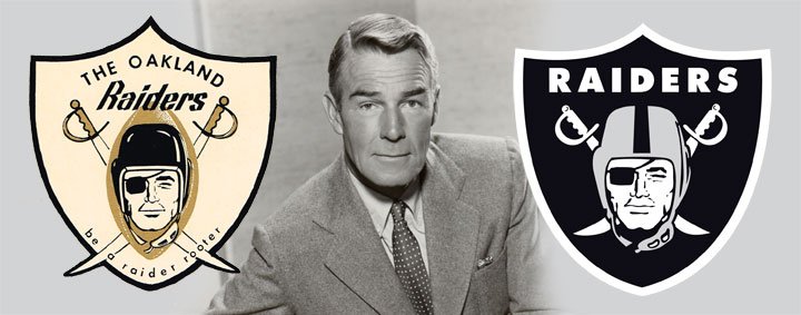
Randolph Scott, a renowned American movie star from the mid-20th century, may not have been directly involved in the creation of the team’s logo, but his features became the inspiration for the iconic emblem. His rugged and determined persona resonated with the team’s identity and helped create a symbol that has stood the test of time.
Evolution of the logo throughout the franchise’s history
The Raiders’ logo has evolved throughout the franchise’s history, but its core design has endured. Since the team’s inception in 1960, the logo has undergone five iterations, with only minor alterations during relocations between Oakland, Los Angeles, and eventually Las Vegas. The team’s colors have remained consistent—white, black, and silver—reflecting the emblem’s timeless appeal
The original Oakland Raiders logo, used from 1960 to 1962, showcased a white, black, and gold color scheme. It featured the iconic raider head inside a gold football, flanked by two crossed swords with gold handles and black details. This design set the foundation for the team’s visual identity.
In 1963, the logo underwent a subtle change, replacing gold with silver and adopting a black and silver shield as the backdrop for the pirate head and crossed swords. Atop the pirate’s head, the wordmark “The Oakland Raiders” was displayed in a block-style typeface, solidifying the team’s name association.
From 1964 to 1981, the logo underwent further simplification. The shield became completely black, while the pirate’s helmet transitioned from black leather to gray, with a broad black stripe running through the center. The swords were slightly shorter, and the wordmark on the emblem was reduced to “Raiders.” This version of the logo became iconic and synonymous with the team during its early years.
In 1982, the team moved to Los Angeles and became the Los Angeles Raiders. Despite the change in location and name, the team retained its visual identity, including the logo. The Los Angeles Raiders logo, used until 1994, remained consistent with the previous design, maintaining the team’s connection to its loyal fan base.
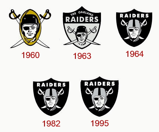
In 1995, the team returned to Oakland, and their logo remained unchanged. The emblem, featuring a modern portrait and a classic shield shape, became instantly recognizable worldwide. The logo stood the test of time, representing the team’s rich history and unwavering commitment to excellence.
With the team’s relocation to Las Vegas in 2020, the logo received a subtle update. The Las Vegas Raiders logo retained the overall design but incorporated minor tweaks. The Raider’s helmet color shifted to a darker gray shade, adding a touch of modernity. Additionally, a thick white outline was added to the shield, enhancing its visual impact.
As the Las Vegas Raiders embark on a new chapter in their history, the logo serves as a reminder of the team’s legacy and the enduring spirit of excellence that has defined them for over six decades.